Visual Form Builder
The Formitiva Builder provides an intuitive drag-and-drop interface that lets you create complex forms without writing a single line of JSON. Simply select components from the palette, drop them onto the canvas, and configure their properties through a visual editor.
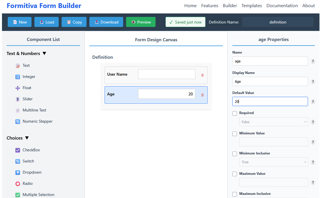
🚀 Visual Form Building Features
📋 Component Palette
Browse 20+ pre-built components organized by category. Simply double-click or drag to add.
🎯 Visual Canvas
See your form structure as you build. Drag components to reorder, click to select and edit.
⚙️ Properties Panel
Configure each field's properties, validation rules, and display options with simple controls.
🔄 Reorder Easily
Drag components up and down to change their order. No need to manually edit array indices.
🧑💻 Code Editor
Edit handler code inline for buttons and advanced behaviors, then export handlers with your form.
📂 Top Bar Buttons & Export
📂 Load
Load a saved form definition. Supports both JSON definition files and ZIP packages that include handler files.
📋 Copy
Copy the current JSON definition to clipboard. Copies definition only (no handler files).
⬇️ Download
Download the current form:
- If there are no handlers → a single JSON file is downloaded.
- If handlers are present → a ZIP file is downloaded containing:
- JSON definition
- Generated handler files
👁️ Preview
Open a live preview of the current form in a new tab or modal to test interactions and handler behavior without exporting.
Note:
Load supports JSON and ZIP.
Copy exports only the definition.
Download exports JSON definition or ZIP (with handlers).
🧩 How It Works
Step 1: Select Components
The left panel displays all available components organized into categories like Basic and Advanced. Each component shows an icon and name to help you identify it quickly.
Adding Components
- Double-click any component to add it instantly to the bottom of your form.
- Drag a component onto the canvas and drop it between existing fields.
- Touch devices can single-tap to add components.
Step 2: Arrange Your Form
The center canvas shows your form structure. Each component appears as a card with its current configuration visible. Reordering is as simple as dragging components to new positions.
Canvas Features
- Visual indicators show where components will drop as you drag.
- Click any component to select it and edit its properties.
- Delete button appears on selected components for easy removal.
- Empty state guides you when starting a new form.
Step 3: Configure Properties
The right panel shows all configurable properties for the selected component. Properties are organized logically, with required fields always visible and optional ones toggleable with checkboxes.
Property Editor
- Name and Display Name are validated for uniqueness.
- Type-specific properties show only relevant options for each component.
- Tooltips provide inline help for complex properties.
- Optional properties can be enabled/disabled with toggle checkboxes.
- Validation feedback appears immediately when values are invalid.
Step 4: Add Code (Optional)
Several properties support inline code editing.
Supported Handler Types
- Button Action — Write a
ButtonHandlerto run when a button is clicked. - Form Validation — Provide a validation handler for form-level checks.
- Field Validation — Add custom validation logic for individual fields.
- Form Submission — Author submission handlers to control how data is sent.
How to Use the Code Editor
- Select a component (for example, a Button) on the canvas.
- Open the Properties panel and find the property labeled Action (or the handler-type property).
- Click the edit/code icon to open the inline Code Editor.
- Author your handler following the shown signature.
- Click Save.
- When you export your form, handler files are generated and include runtime registration so they can be wired automatically.
📱 Mobile-Friendly Interface
The builder adapts to smaller screens with a responsive layout. On mobile devices, panels can be toggled to maximize workspace, and touch gestures are fully supported for adding and rearranging components.
Responsive Layout
Panels stack vertically on smaller screens, with toggle buttons to show/hide them as needed.
👆 Touch Support
Single-tap to add components, swipe to scroll, and pinch to zoom on mobile devices.
⌨️ Keyboard Navigation
Full keyboard support with Tab, Arrow keys, Enter, and Delete for accessibility.
🚀 Start Building Now
The drag-and-drop builder makes form creation fast and intuitive. Start from scratch or load a template to customize.